
HOBZ UP
A self-directed design exercise
A sportswear e-commerce landing page I set myself, with no client and no brief. A full journey from hero to footer, including the sections nobody enjoys designing, built to find out what the page needs rather than what looks good in a shot.
Case study
The exercise
No client, on purpose
I set myself a challenge: design a full sportswear e-commerce landing page, from hero to footer, with no brief and no one to please but the work. The goal was not a portfolio piece. It was to push a louder, higher-energy visual direction than my product work usually calls for, and to see if I could hold it across a whole page.
The direction
Loud on purpose
Sportswear lives on energy, so I built the page around it: a red and black palette, hard diagonal motion, and large confident type. Red carries the action and nothing else, so a single accent word or button pulls the eye exactly where it should go on a page that is otherwise dark and still. The restraint is what keeps the energy from turning into noise.
The build
A full page, not a poster
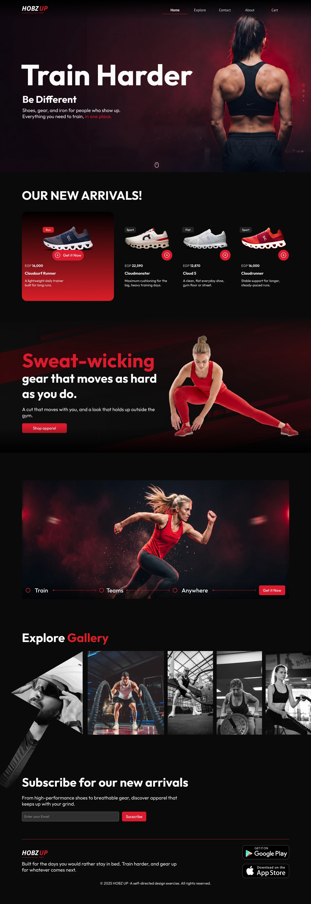
I designed the whole journey a real store needs, not just a pretty hero:
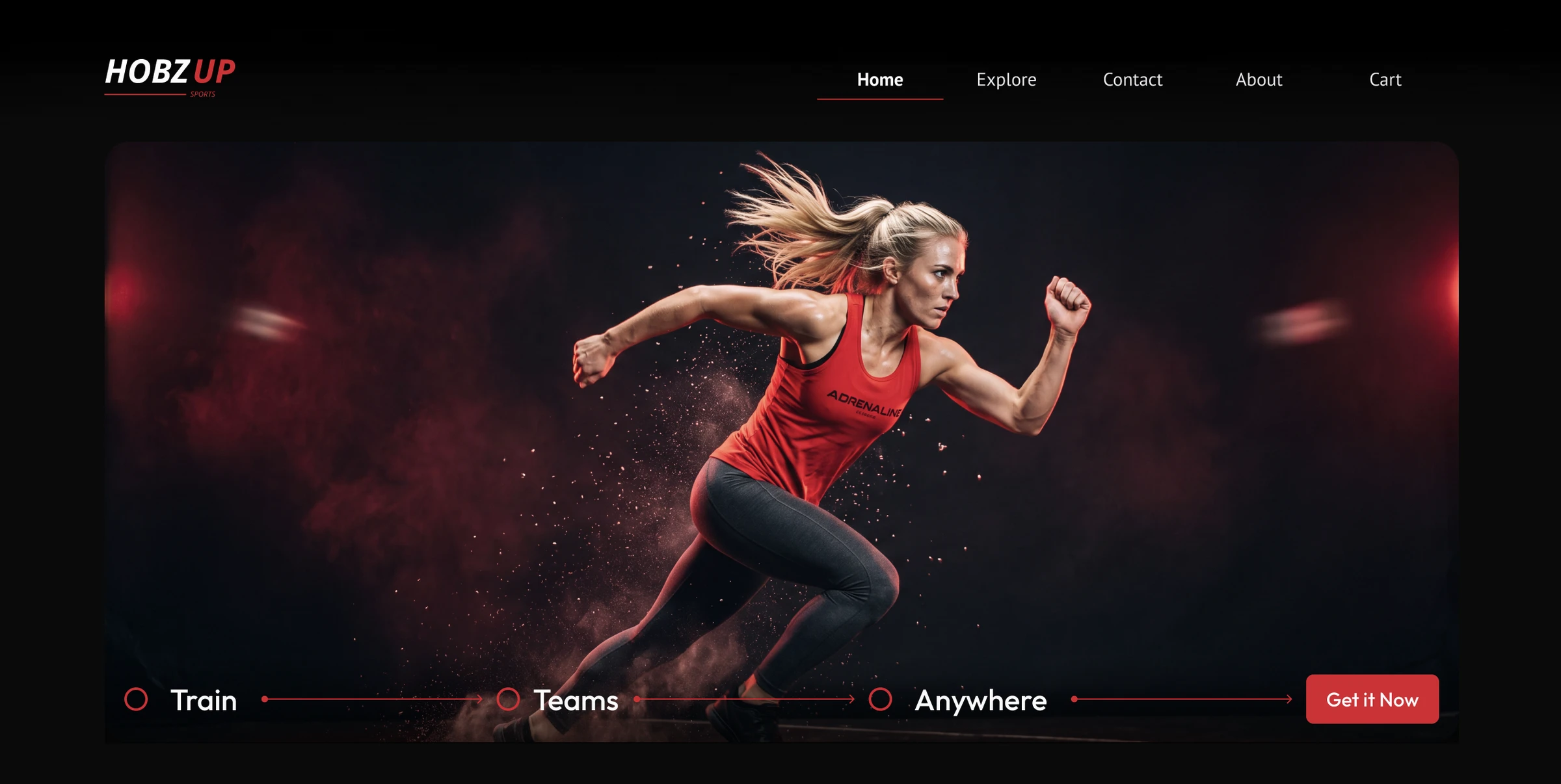
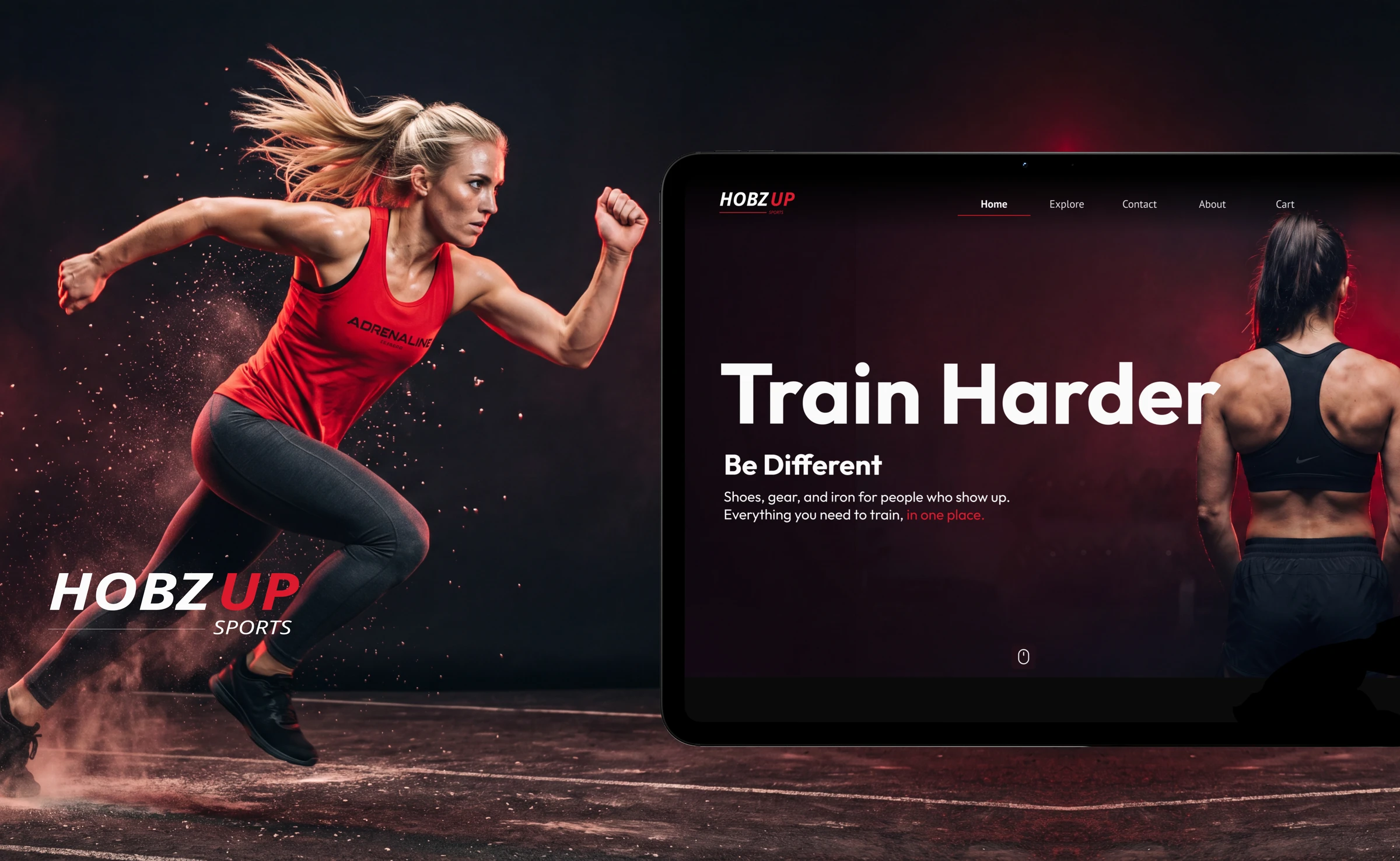
- A hero that states the attitude before the product
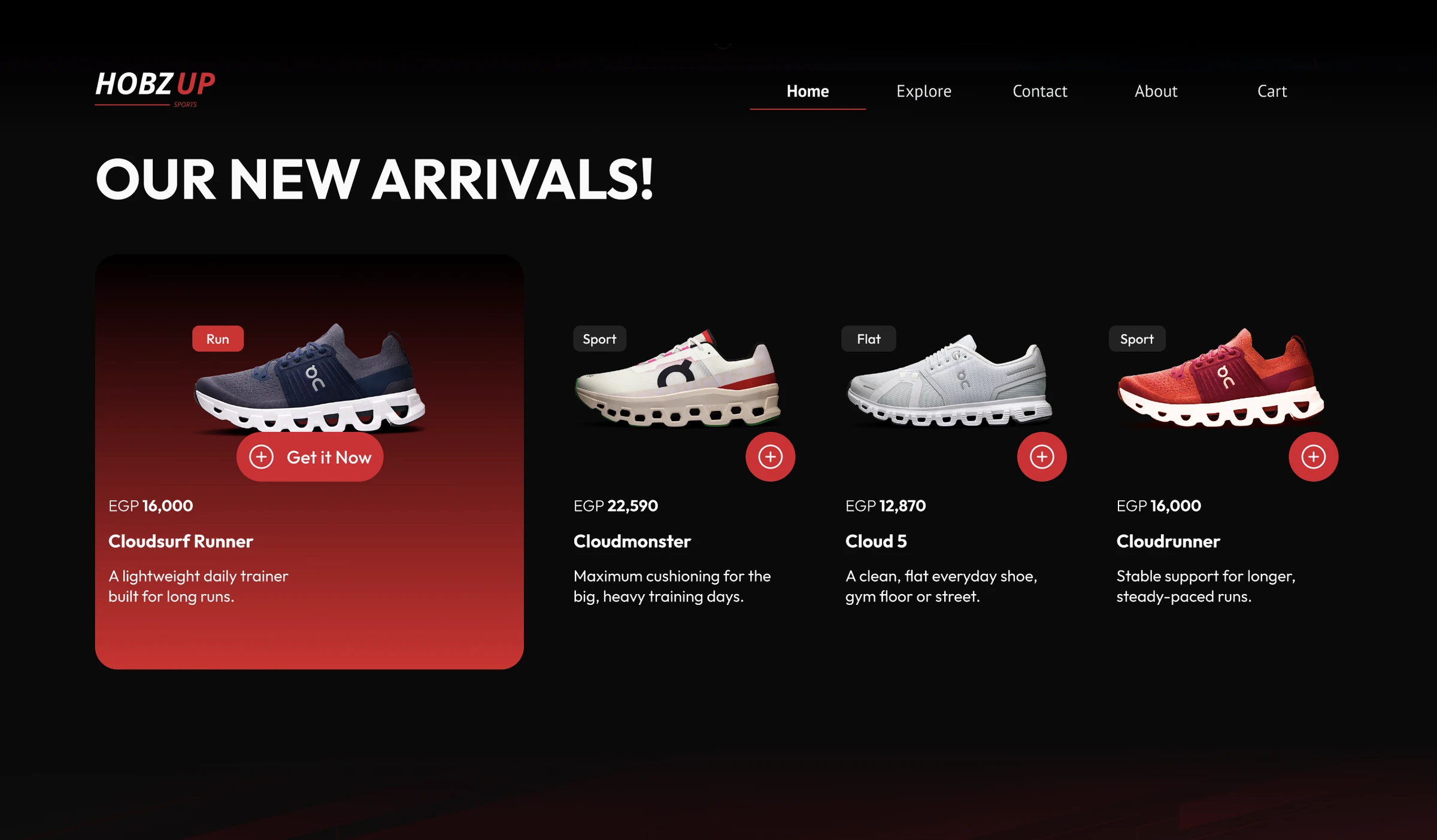
- New arrivals as product cards, each with its own name and price
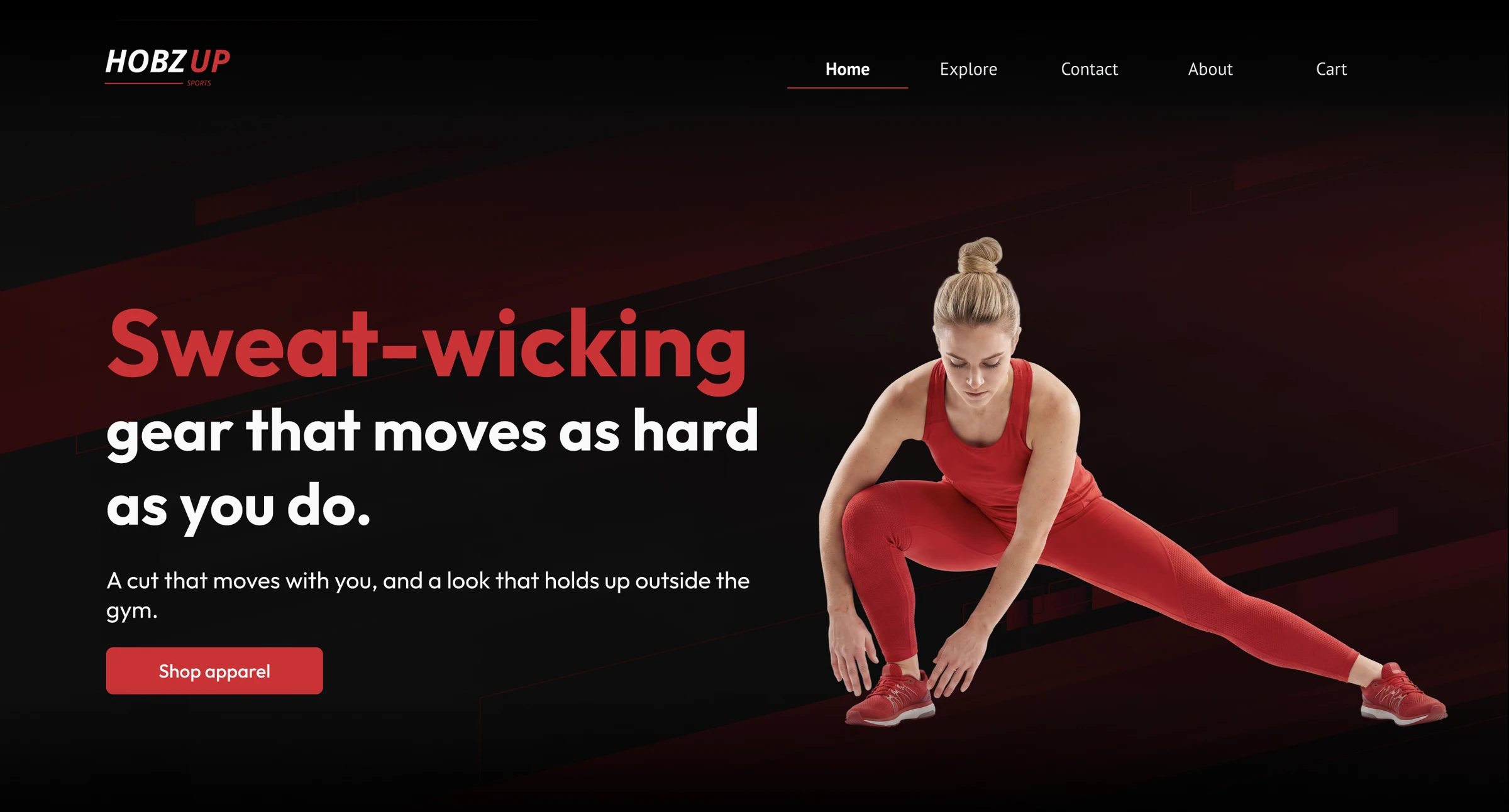
- A feature band for apparel, with motion built into the layout
- An interactive category row that reveals its copy on hover
- A gallery of training shots
- Email capture and a complete footer
Designing every section, including the boring ones, is where an exercise stops being a mood board and starts being a product.
The Design
Prototype
See it move
Screens do not show interaction, and this page has a lot of it: the category row reveals its copy on hover, the diagonals and running figures carry motion through the layout, and the product cards respond as you move across them. The prototype is where the energy the design is built on actually reads.
What I practiced
What I took from it
- Holding one accent colour. Keeping red for action only, across a whole page, was harder and more useful than adding more colour would have been.
- Motion as layout. The diagonals and the running figures make the page feel like it is moving before anything animates.
- Interaction with restraint. The category row hides its detail until hover, so the page stays calm until you ask it for more.
- Copy is part of the design. The first pass reused one line everywhere, and rewriting each section to stand on its own taught me that filler text undoes good layout faster than a bad grid does.
Honest note
For the record
HOBZ UP is a concept I designed for myself, not a real store and not client work. Everything here, brand and all, is mine, made to practice a direction I do not get to use every day.