
Nawy
Largest Proptech in Africa
Nawy's listings were organised the way the sales team talked to buyers: compound first. Research showed buyers think unit first. Reframing the listing around the unit cut search-page drop-off from 58% to 13%.
Case studies
Why an app
Ninety percent of the audience was already on a phone
Nawy's traffic split was not close. Mobile was 90% of sessions. Desktop was 8%. Tablet was 2%. Every design decision in the company was being made on a desktop canvas for an audience that was almost entirely holding a phone.
The web experience worked on a phone, but "works on a phone" and "built for a phone" are different products. A browser tab is something you leave. An installed app is something you come back to.
| value | label |
|---|---|
| 90% | Mobile sessions |
| 8% | Desktop |
| 2% | Tablet |
The real argument
The lead quality argument
The case for the app was never about traffic. It was about intent.
Someone who downloads an app, searches inside it, and keeps going is not browsing. They are buying.
A web visitor can arrive from a search result, scroll once, and leave. The cost of showing up is nearly zero, and so is the signal. Installing an app costs the user something: storage, a decision, a step. Every user who paid that cost and then went searching was telling the sales team something a web session never could. App conversions produced the highest-quality leads in the funnel.
Scope
What version one had to be
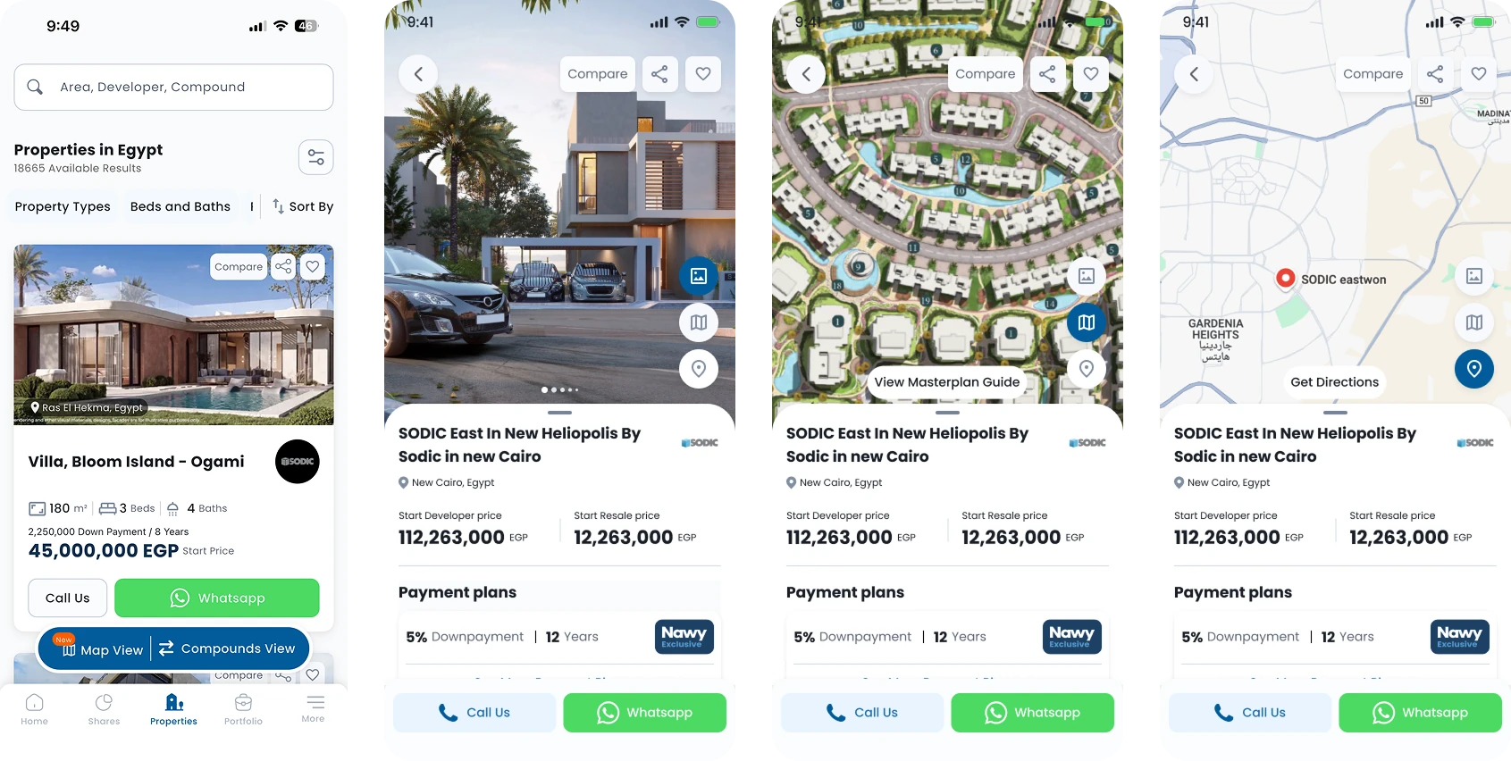
A first release fails by trying to match the website. We scoped v1 to the shortest complete path a buyer actually walks, from "I'm looking" to "I want to talk to someone about this unit", and shipped nothing that sat outside it.
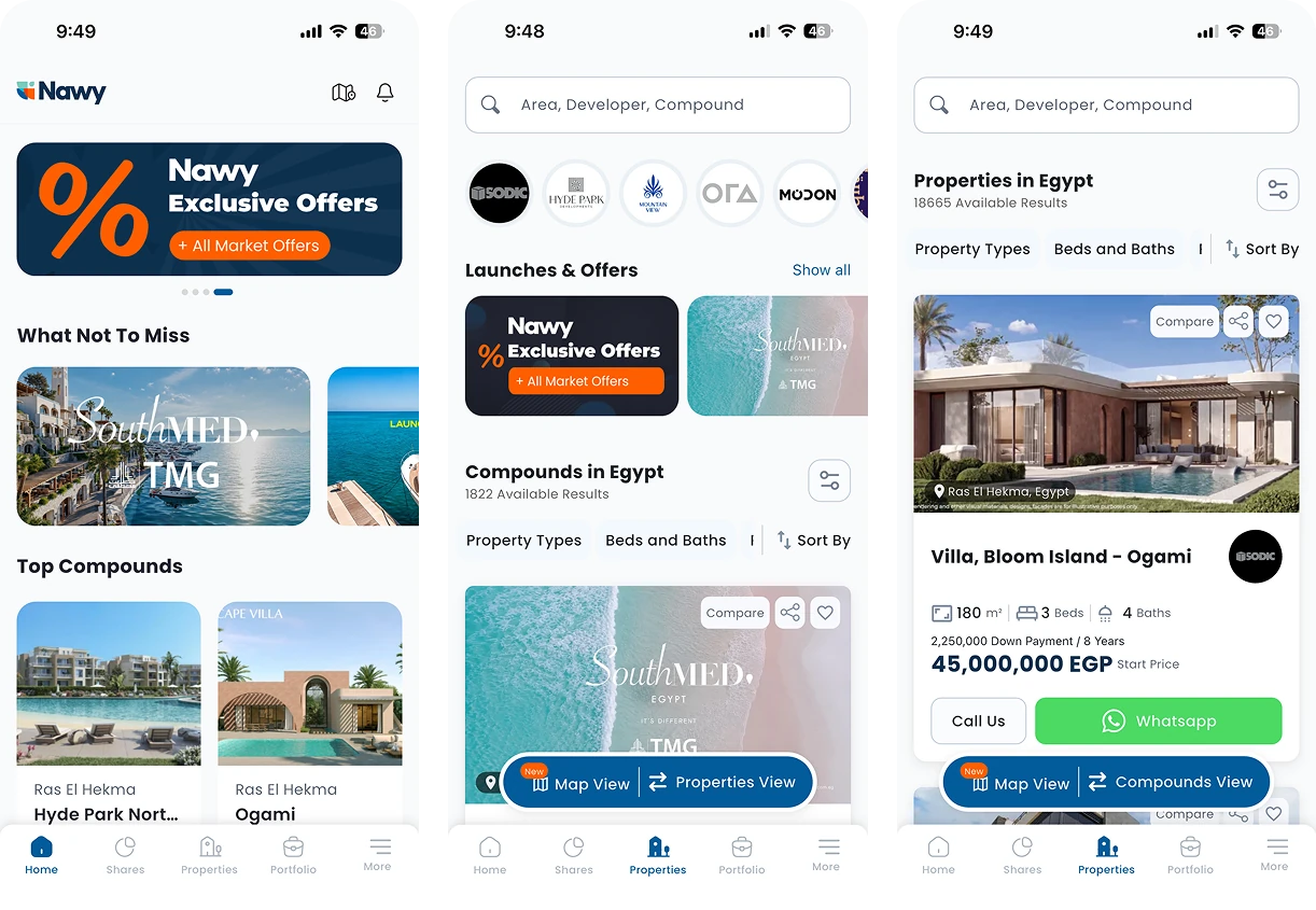
- Search entry point, the way in, not a feature buried in a tab
- Listing pages for both compounds and properties, explore and search
- Unit detail page, where the decision actually happens
- Compound detail page, the context around the unit
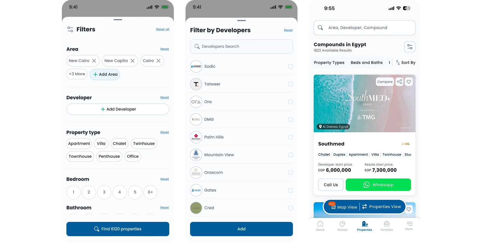
- Developers, browse by developer, and reach their compounds
Everything else waited. Not because it did not matter, but because a v1 that does five things properly beats a v1 that does fifteen things approximately.
The mobile-only decision
The one thing the app had that the site did not
Developers got their own entry point. On the website, a developer was metadata, a name attached to a compound. On mobile we made it a way in: browse developers, pick one, land in their compounds.
This came from how buyers actually talk. In an off-plan market, the developer's name is the credibility. People do not say "I want a compound in New Cairo". They say "I want something by SODIC." The website structure had no answer to that sentence. The app did.
Mobile-first as a working rule
Designing the small screen first, every time
Once the split was on the table, mobile-first stopped being a preference and became the order of work. I designed the phone screen first and expanded outward to the web, rather than designing wide and compressing.
The difference is not layout, it is what survives. Designing down forces you to decide what is essential and then add; designing wide lets you defer that decision until the screen makes it for you, badly.
How we worked
The team
The app was built by the same team behind the web product, plus one Flutter developer. Product went from one PM to two. I worked directly with the PM on scope and sequencing, and ran grooming with the developers so the build questions were answered in the design rather than in the ticket.
Reflection
Scoping to five things was right; sequencing them was not. We built the listing pages before the search entry point, and spent two weeks navigating a product with no front door.