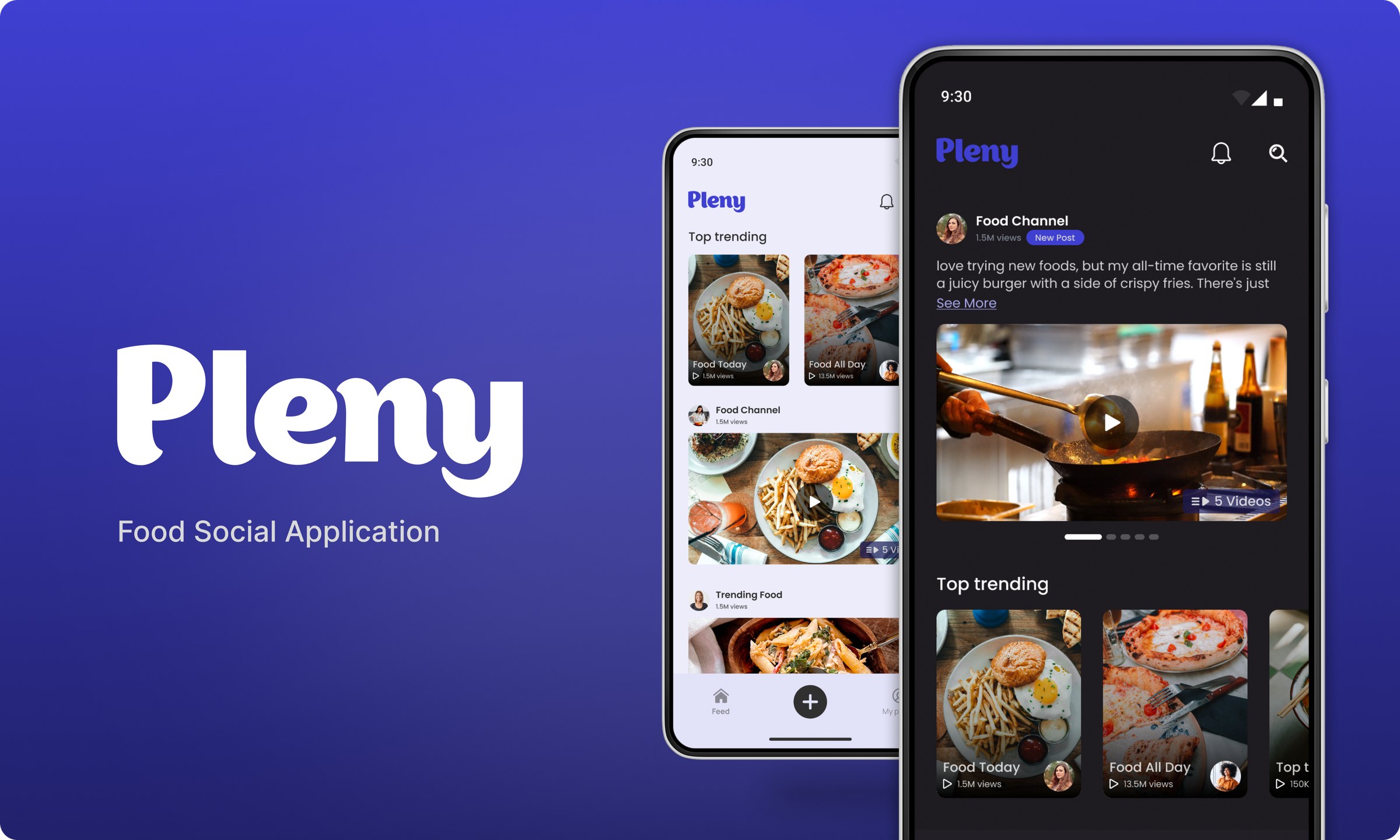

Pleny
A food social platform, UAE
Pleny is a food-focused social platform in the UAE. I led UI and UX across the iOS and Android apps and built the design system behind them.
Case study
The task
A challenge before the job
Before Pleny hired me, they sent a design task: design the flow for adding portrait videos to a social post. It came with real constraints, and I have kept them here in the brief's own words because a problem stated by the client is worth more than one I could invent.
- Select portrait videos from an Android device
- Preview multiple selected videos
- Trim each video to a five minute limit
- Show how the videos appear while creating the post
- Not every video is over five minutes, so handle both cases
Android only, English, and dark mode was allowed.
Framing
Where the real problem was
The brief looks like four screens. The actual problem is one sentence inside it: not every video is over five minutes. That single line decides whether the flow feels smart or clumsy, because a design that forces everyone through a trimmer punishes the person whose clip was already fine.
I looked at how Facebook and Instagram handle video posting, and took one principle from both: never make the user do a step the content does not need.
User flow
The logic before the pixels
I mapped the journey as a flow first, so the branching was a decision on paper rather than something discovered mid-design. The five minute rule became the one fork in the path: over the limit, trimming is required; under it, the user passes straight through and can still trim if they want to.

Wireframes
Structure before surface
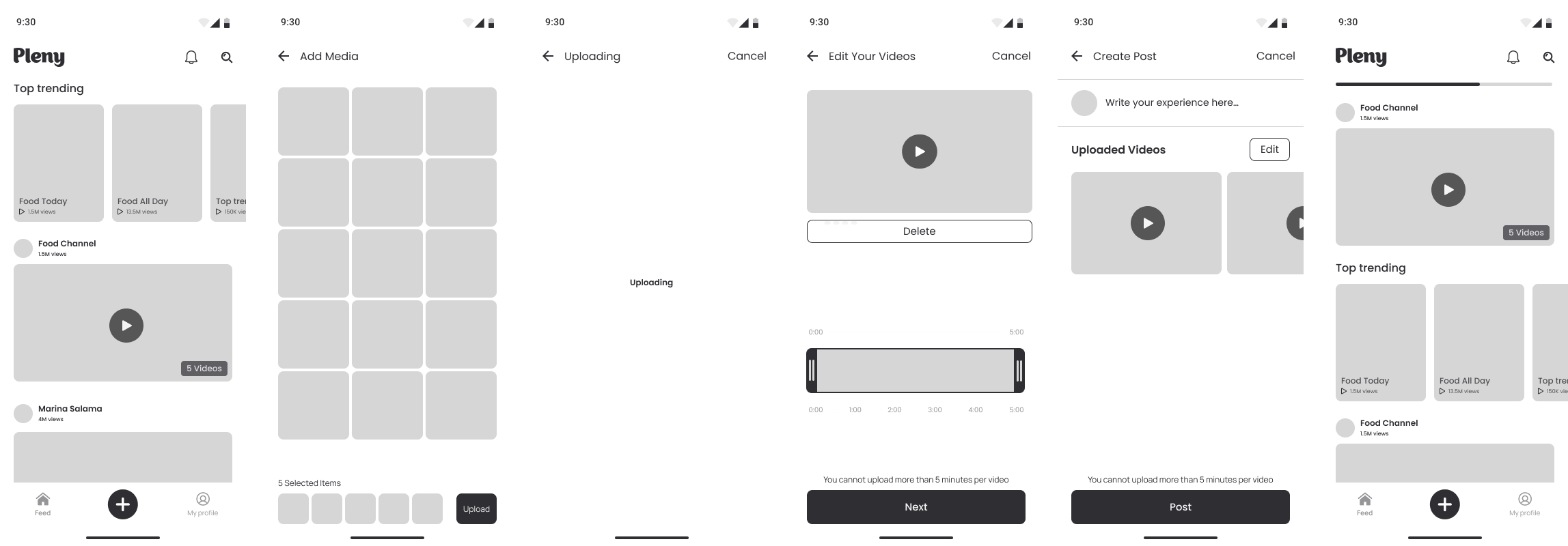
Before any visual design, I laid the screens out as wireframes to settle hierarchy and step order without the distraction of colour or type. The question at this stage was only "what is on each screen and in what order", which is the cheapest question to answer wrong and the most expensive to fix late.
The solution
Six screens, one clean line
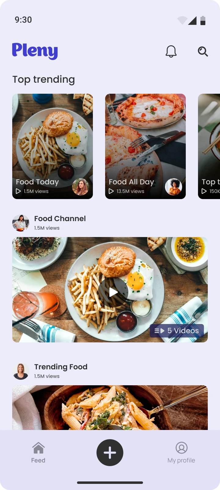
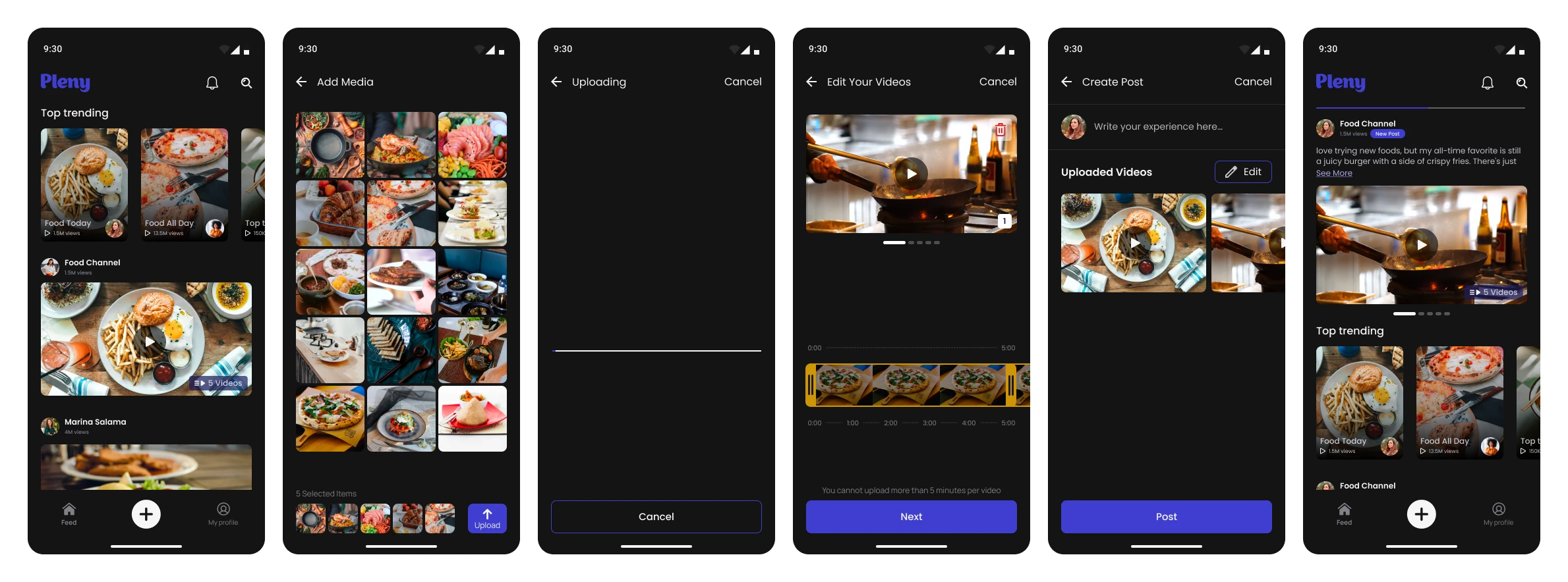
The final flow moves from the feed to a posted video without a wasted step:
- Feed: the plus button opens the flow
- Add Media: the gallery, with multi-select from the start, so a batch of clips is chosen at once rather than one at a time
- Edit Your Videos: preview and a trim timeline in the same screen, with the five minute limit shown inline as a rule rather than a blocking gate
- Create Post: caption and the attached videos
- Post: returns the user straight to the feed, processing in the background, and confirms with a toast once it is done
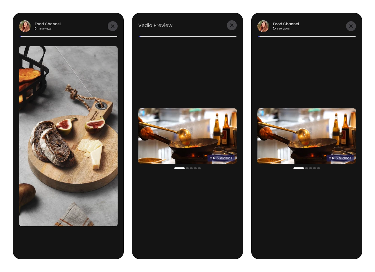
Key decisions
Four choices that shaped it
Write the thinking here, what you decided and why.
- Trimming lives inside the edit screen, not a separate step. The brief asked for fewer clicks, so the trimmer is where the preview already is.
- The five minute limit is a rule on the screen, not a wall in the flow. It is shown where trimming happens, so it guides rather than interrupts.
- Multi-select from the first screen. Posting is usually more than one clip, so the flow is built for a batch, not repeated for each video.
- Processing was moved to the background. Instead of holding the user on an upload screen, pressing Post returns them to the feed immediately and a toast confirms when the videos are live. Their time back is worth more than a progress bar.
Outcome
The result
Pleny hired me after this task, and I went on to work on the app itself. The strongest thing a design task can prove is not a screen. It is that the thinking behind the screen was worth betting a role on.