
Rasid
A self-directed fintech dashboard concept
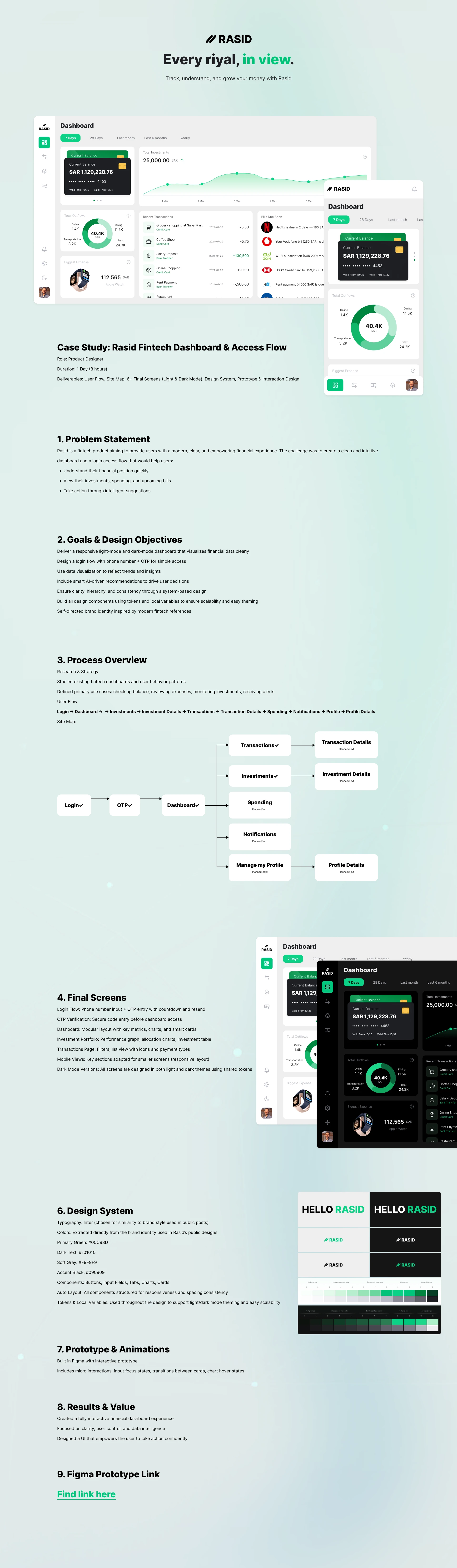
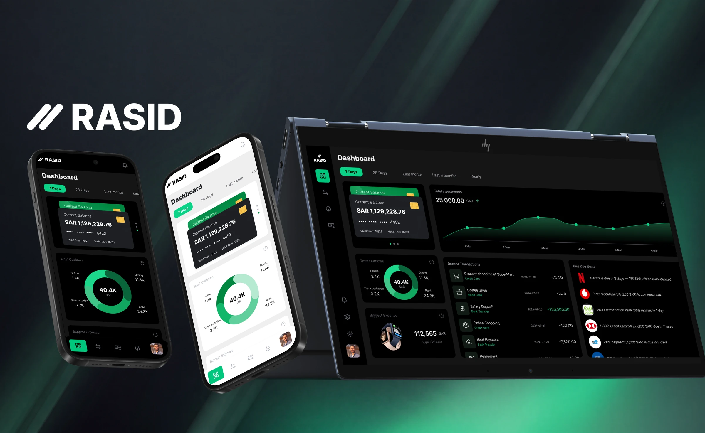
Rasid is a fintech concept I set myself: a complete money experience, from a phone and OTP login to a dashboard that shows balance, spending, investments and upcoming bills. Built as a system in light and dark, across web, tablet and mobile, on one set of tokens.
Case study
The exercise
A product, start to finish
I set myself a challenge: design a complete fintech experience, from the login flow to a full money dashboard, with no brief and no client.
The goal was not a single pretty screen. It was to build a real product as a system, in both light and dark, over a couple of focused days, and to see if I could keep it consistent all the way through. The idea behind it was simple: every riyal, in view.
The direction
Calm, with one green
Money apps carry a lot of anxiety, so I designed against it. Near neutral surfaces, generous space, and clear hierarchy keep the screen calm, and a single emerald green carries action and positive movement and nothing else.
Because only one thing is green, the eye lands exactly where it should: the balance, a positive change, the next step. The restraint is what lets the data read before any decoration does.
The build
A system, not a screen
I designed the whole journey a real product needs, not just a hero dashboard:
- A phone number and OTP access flow, with countdown and resend
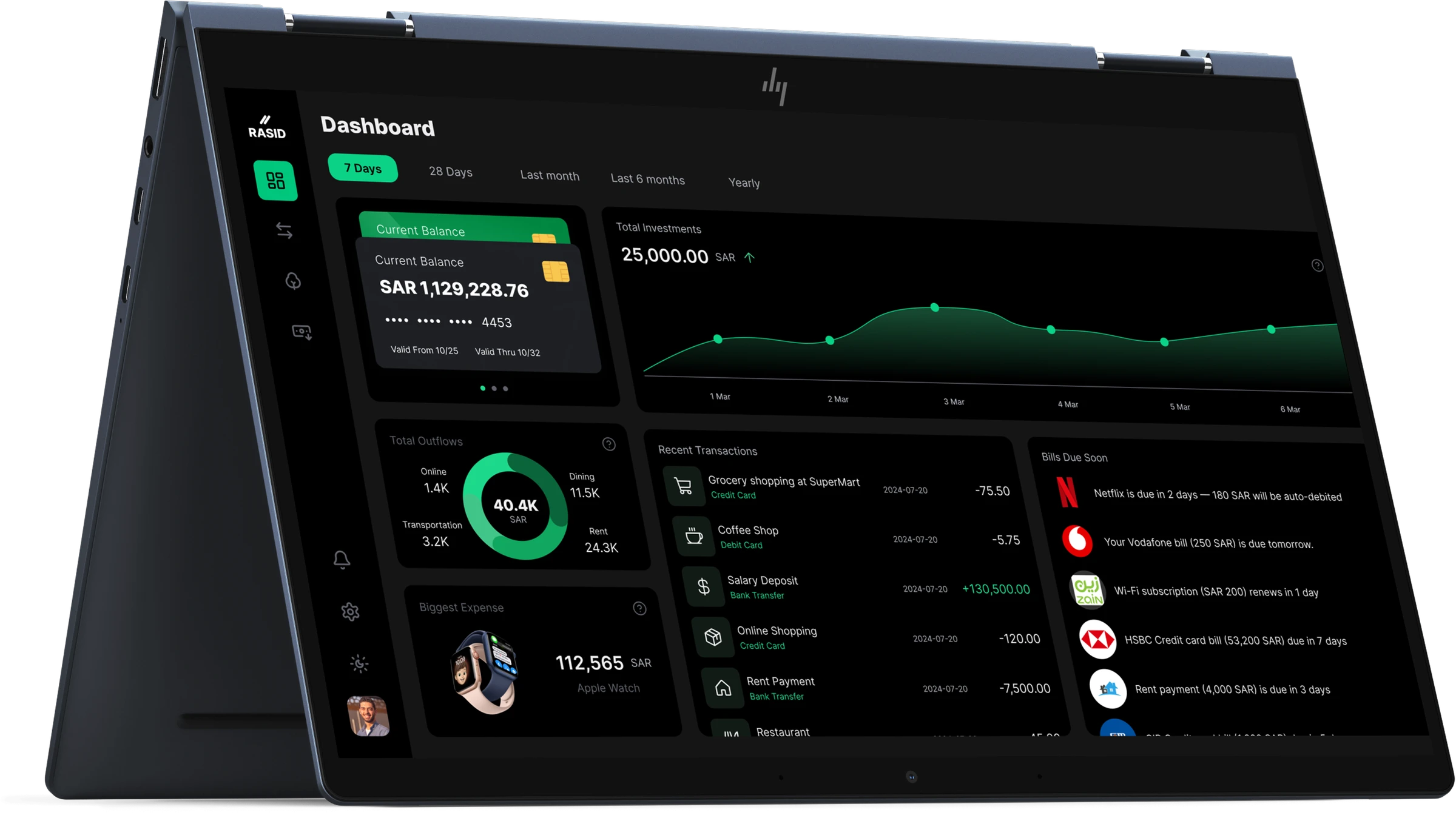
- A modular dashboard: balance, investment trend, outflow breakdown, upcoming bills, and biggest expense
- An investments page with a performance graph, allocation, and a holdings table
- A transactions page with filters and a categorized list
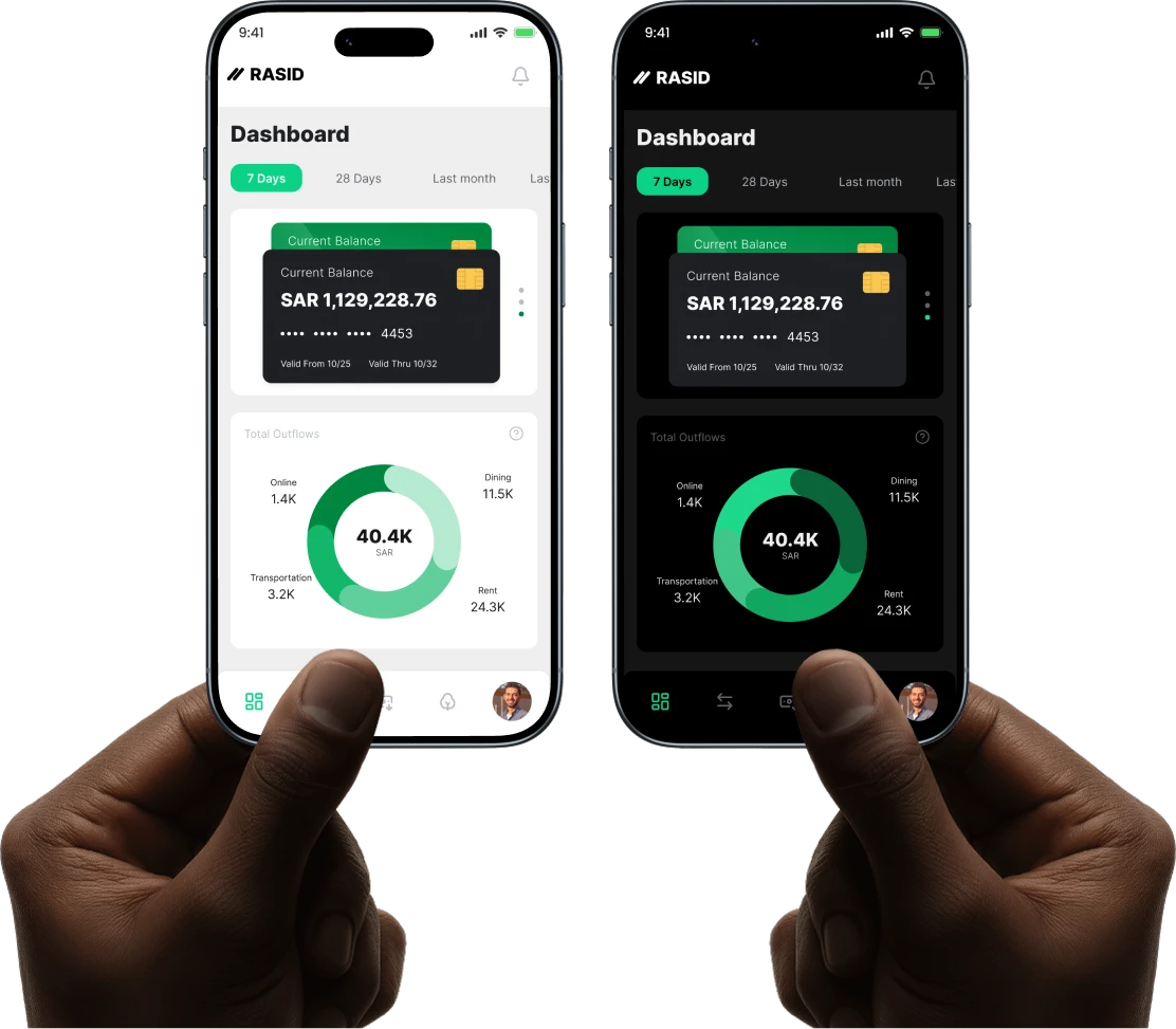
- Full light and dark, across web, tablet, and mobile
- A token and component library so every screen and both themes stay consistent
Designing the parts nobody notices, the tokens, the states, the second theme, is where an exercise stops being a mockup and starts being a product.
The Design
The design system
Tokens, not guesswork
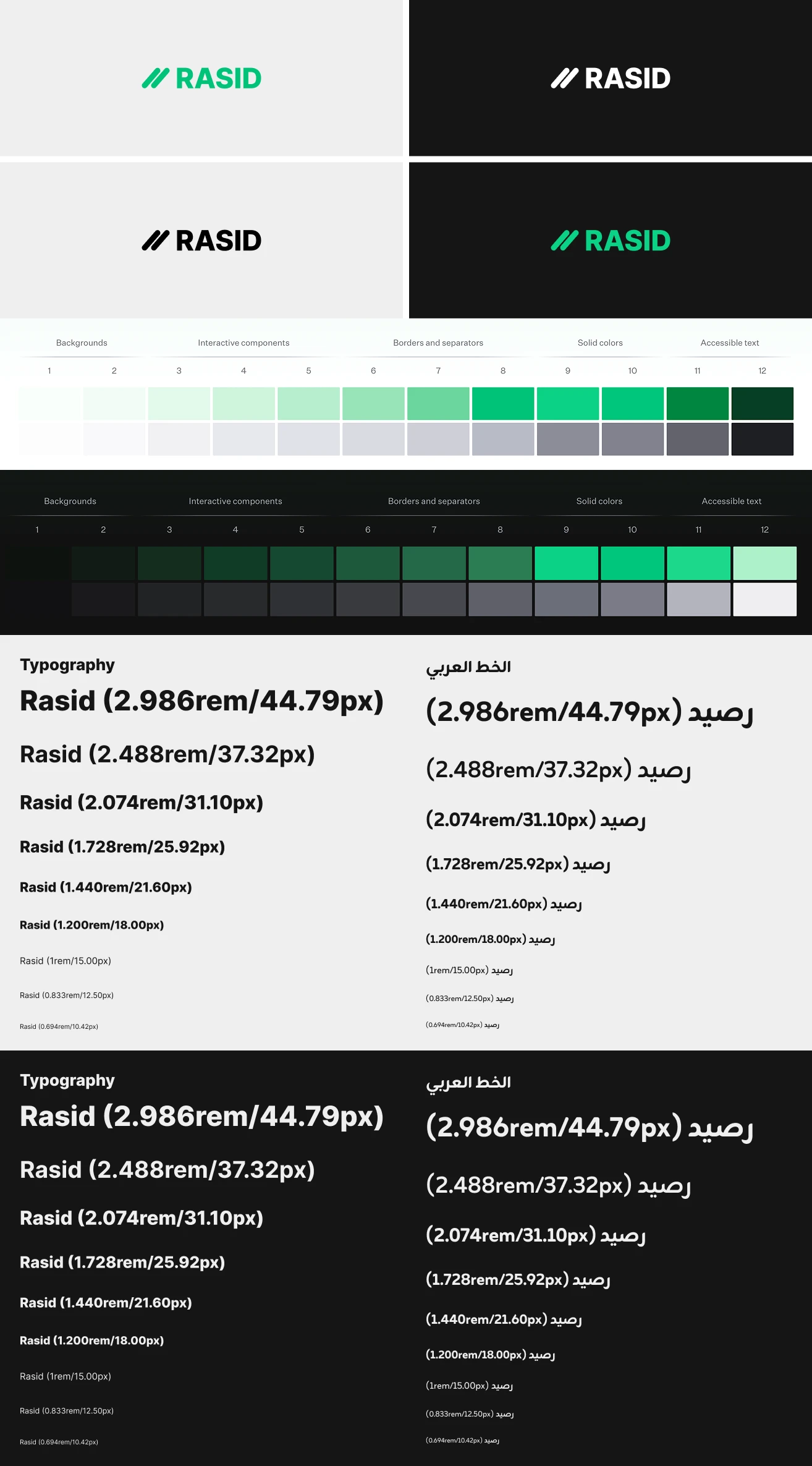
Every value in Rasid is a token, so light and dark are the same components rather than two separate designs, and a new screen inherits the system instead of reinventing it.
- Type: Inter, on a modular scale that holds up in English and Arabic
- Colour: one emerald green (
- #00C980) with a full green scale and neutrals, defined for light and dark
- Tokens and local variables: colour, spacing, and radius, so theming is a switch, not a redraw
- Components: buttons, inputs, tabs, charts, and cards, all built in auto layout
What I practiced
What I took from it
- System before screens. Building tokens and local variables first meant light and dark, and every new screen, came almost for free. The setup cost paid for itself by the second theme.
- Holding one accent colour. Keeping green for action and positive change only, across a whole product, was harder and more useful than adding more colour would have been.
- Designing data, not decorating it. A donut for the outflow split, an area chart for the balance trend, both kept to the green scale and neutrals, so the numbers read at a glance instead of fighting for attention.
- Scoping honestly. I built the core flows and marked the rest, spending, notifications, profile, and the detail screens, as next, instead of half designing everything at once.
Prototype
Take it with you